
MEDIUM INK & COMPANY
BRAND IDENTITY PORTFOLIO
This portfolio reflects a curated collection of brand identities I’ve designed for purpose-driven founders building with intention.
Each mark was developed through thoughtful strategy, refined design, and a deep understanding of the brand’s voice, audience, and long-term vision. While this page represents only a portion of the work I’ve had the privilege to create, every identity featured here tells a story of clarity, growth, and alignment.
I believe brand identity is more than a logo, it is the visual foundation of a business stepping fully into who it is called to be.
I invite you to explore the work below.
🤍 Tenia Taylor
MY APPROACH TO BRAND IDENTITY
I like to first begin with clarity. Before a single concept is explored, I take time to understand the heart of the brand, its positioning, audience, and my client’s long-term vision.
From there, I build brand identities that are both beautiful and purposeful designed to reflect where the business is now and where it’s headed. A logo should not simply look good, it should feel grounded, intentional, and built to grow with the business.
Behind every mark is a story. Here’s a closer look at a few featured collaborations.
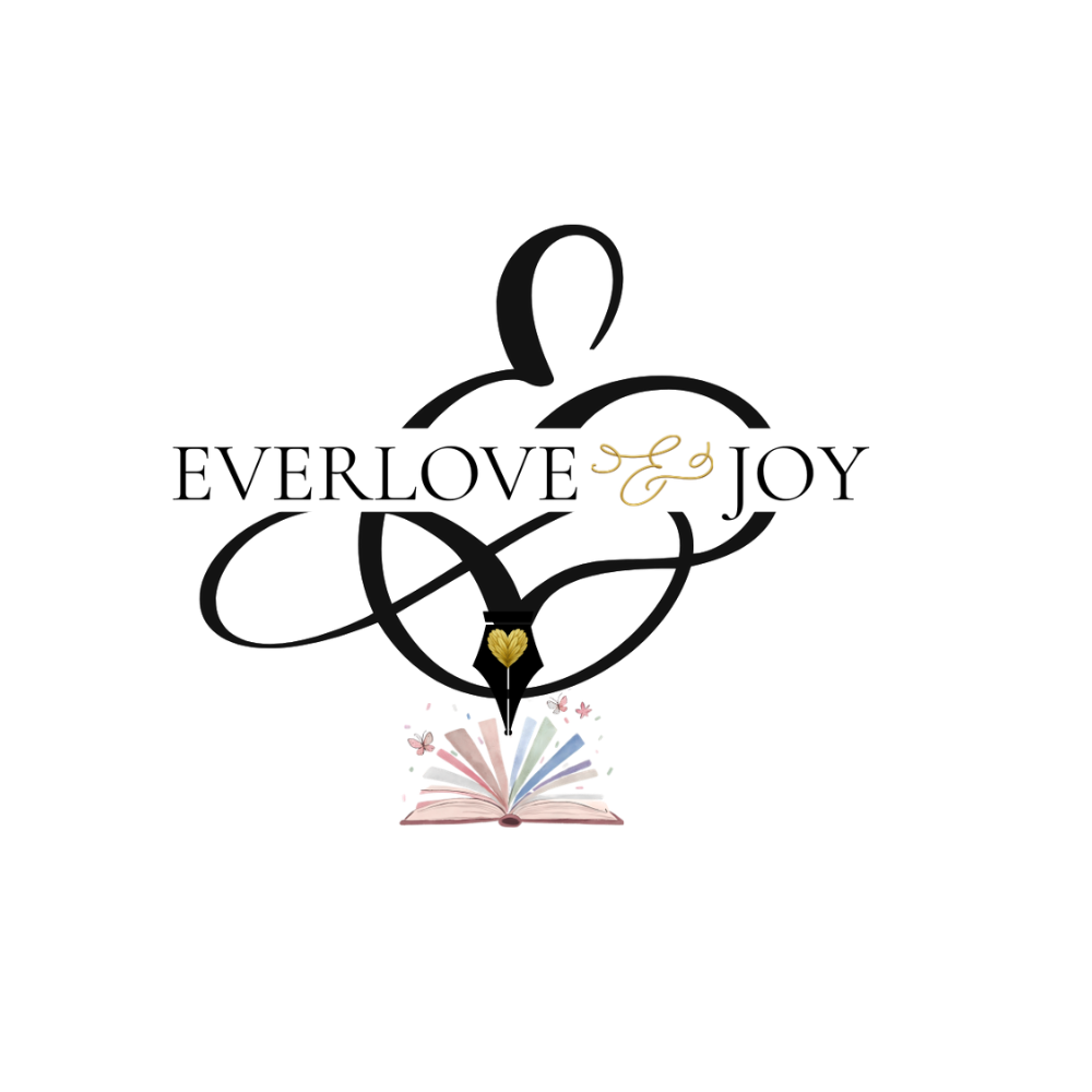
CLIENT: EVERLOVE & JOY
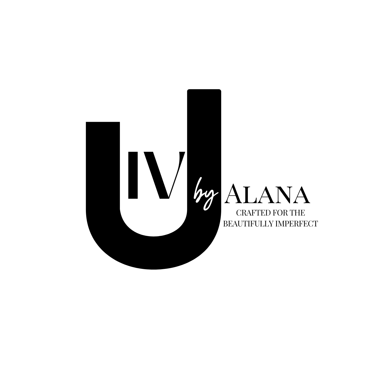
CLIENT: IV U BY ALANA

CLIENT: HEMPORIUM AVEUNE
FEATURED CASE STUDIES
Logo Concept & Creative Direction
When designing the identity for Everlove & Joy, our intention was to create a mark that feels refined, timeless, and deeply intentional a visual signature worthy of a luxury journal house.
At the center of the design is a custom, sculptural ampersand symbolizing the union of love and joy. Its fluid, calligraphic form evokes sophistication and grace, while the lower curve seamlessly transforms into a fountain pen nib a subtle yet powerful homage to the art of fine writing.
The pen tip, accented in gold, represents value, permanence, and the elevated experience of putting pen to paper. This is not simply about journaling it is about ritual, reflection, and legacy.
Anchoring the mark is an open book, delicately illuminated, symbolizing stories unfolding, ideas taking shape, and personal narratives preserved with intention.
The final identity balances elegance with meaning positioning Everlove & Joy as a luxury brand rooted in artistry, refinement, and the transformative power of written expression.
CLIENT: EVERLOVE & JOY
Logo Concept & Creative Direction
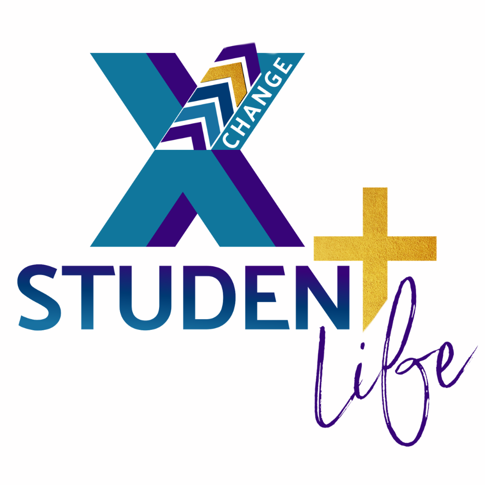
When designing the identity for X-Change Student Life, our goal was to create a mark that felt dynamic, meaningful, and rooted in faith — something that would resonate deeply with youth while visually representing spiritual transformation.
At the center of the design is a bold “X,” symbolizing change and the transformative power of faith in action. The layered geometric elements within the X represent growth, movement, and progression, illustrating the journey students take as they mature spiritually and personally.
The word “CHANGE” is intentionally integrated into the mark, reinforcing the ministry’s mission: lives transformed through Christ. The gold arrow element symbolizes forward momentum, purpose, and divine direction, pointing students toward growth and calling.
The gold cross stands prominently beside the word “Student,” grounding the brand in its faith foundation. Its textured finish adds depth and significance, representing sacrifice, strength, and unwavering belief.
Finally, the handwritten “Life” brings warmth and approachability, reflecting authenticity, community, and the real-life experiences students share together.
The result is an identity that balances energy with purpose, youthful yet grounded, modern yet deeply faith-centered embodying transformation, connection, and the power of spiritual change.
CLIENT: X-CHANGE STUDENT LIFE MINISTRY (WOOMC CHURCH | MEMPHIS, TN )
Logo Concept & Creative Direction
When designing the identity for Essential Pieces Therapy Plus, our goal was to visually represent wholeness, connection, and the restorative journey of healing.
At the center of the mark is a circular arrangement of interlocking puzzle pieces, symbolizing that every individual is made up of essential parts that together form a complete and unique whole. The circular shape reinforces unity, continuity, and ongoing growth.
The subtle human figures integrated within the puzzle design represent connection, support, and relational care core elements of therapeutic work. The vibrant yet balanced color palette reflects diversity, emotional depth, and the range of experiences clients bring into the therapeutic space.
The “EPT” monogram sits at the center, grounding the design in clarity and professionalism while reinforcing brand recognition.
The typography pairing balances trust and warmth:
The serif typeface for Essential Pieces conveys credibility, stability, and expertise.
The handwritten script for Therapy Plus introduces approachability and compassion, reminding clients that therapy is both structured and deeply human.
The final identity communicates safety, integration, and hope, visually reinforcing the message that healing happens when all the essential pieces come together.
CLIENT: ESSENTIAL PIECES THERAPY PLUS
EXTENDED BRAND PORTFOLIO


Branding ~ Website Design ~ Brand Photography ~ Brand Strategy ~ Graphic Design Virtual Assistance
Branding ~ Website Design ~ Brand Photography ~ Brand Strategy ~ Graphic Design Virtual Assistance